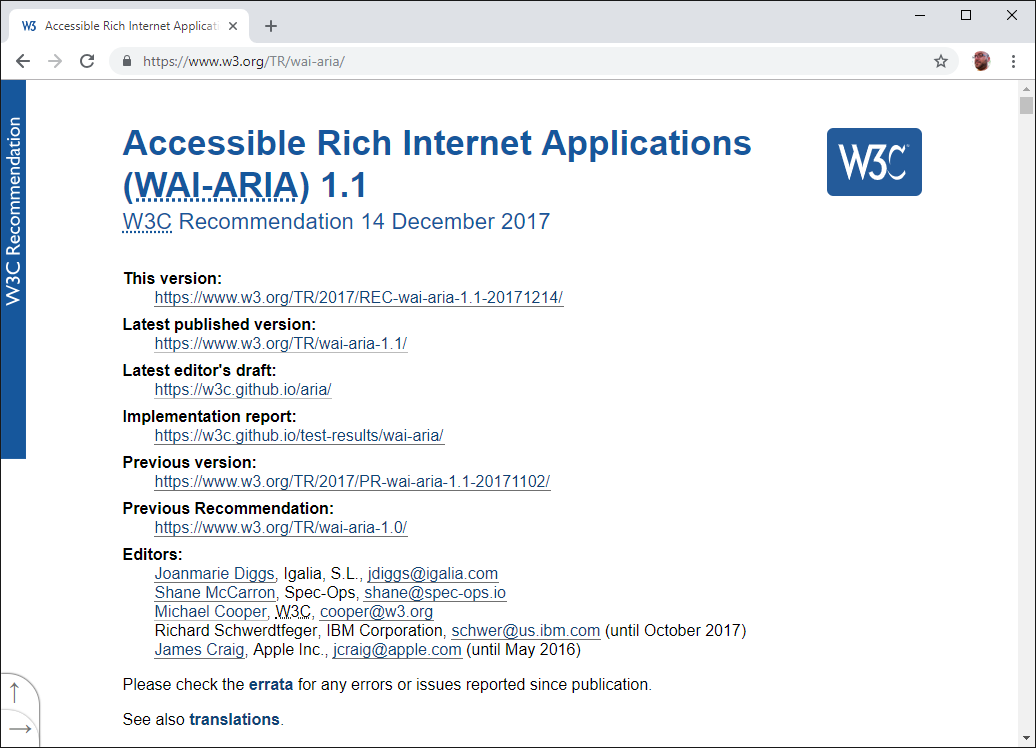
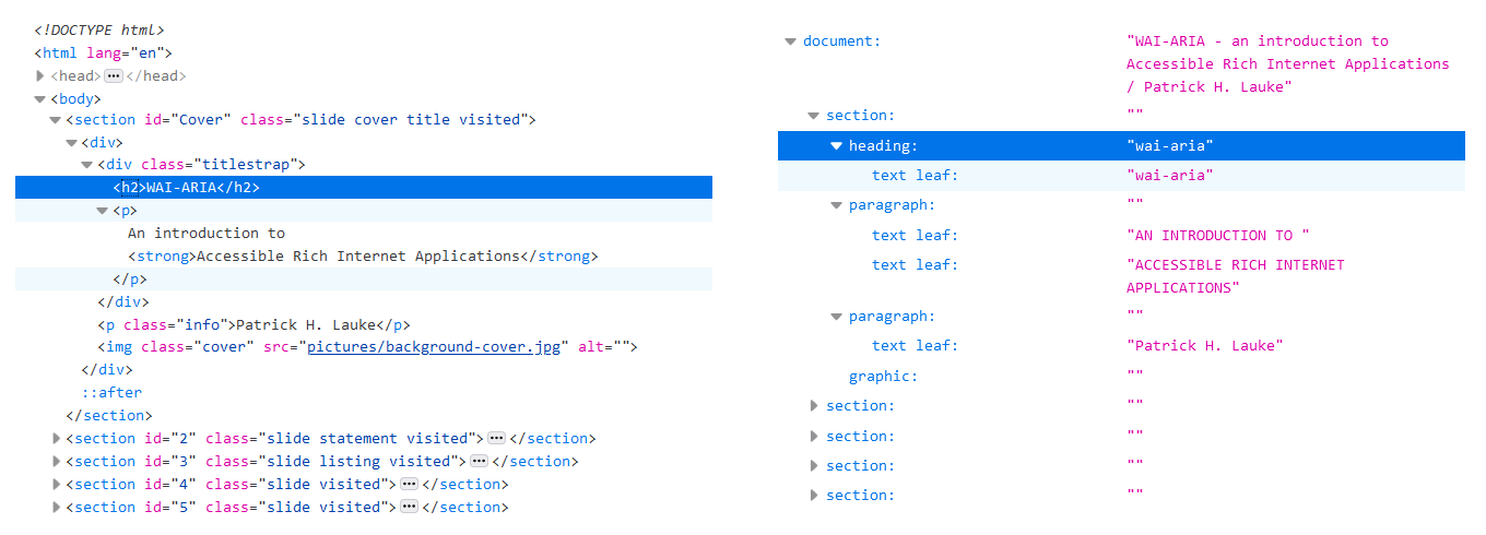
WAI-ARIA
An introduction to Accessible Rich Internet Applications
Patrick H. Lauke

An introduction to Accessible Rich Internet Applications
An introduction to Accessible Rich Internet Applications
Patrick H. Lauke
code examples here are simplified
(but will hopefully convey the right concepts)


<div onclick="...">Test</div>for a sighted mouse / touchscreen user this is a button...
but what about keyboard users?
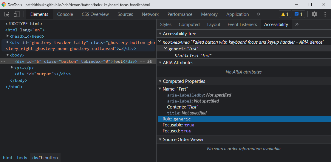
<div tabindex="0" onclick="...">Test</div>now we can at least focus it...but can we activate it?
<div tabindex="0" onkeyup="..." onclick="...">Test</div>faked button with focus and keyboard handling
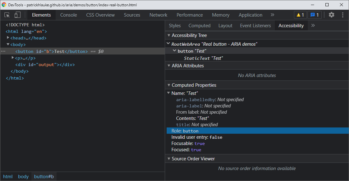
for a sighted mouse / touchscreen / keyboard user this is a button...
but what about assistive technology users?
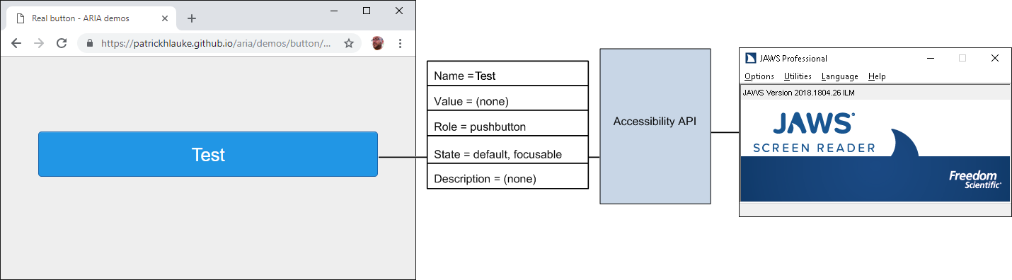
Operating systems provide interfaces that expose information about objects and events to assistive technologies
(e.g. Microsoft Active Accessibility [MSAA], the Mac OS X Accessibility Protocol [AXAPI], IAccessible2 [IA2])
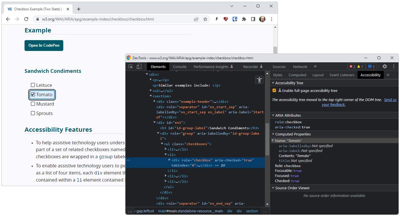
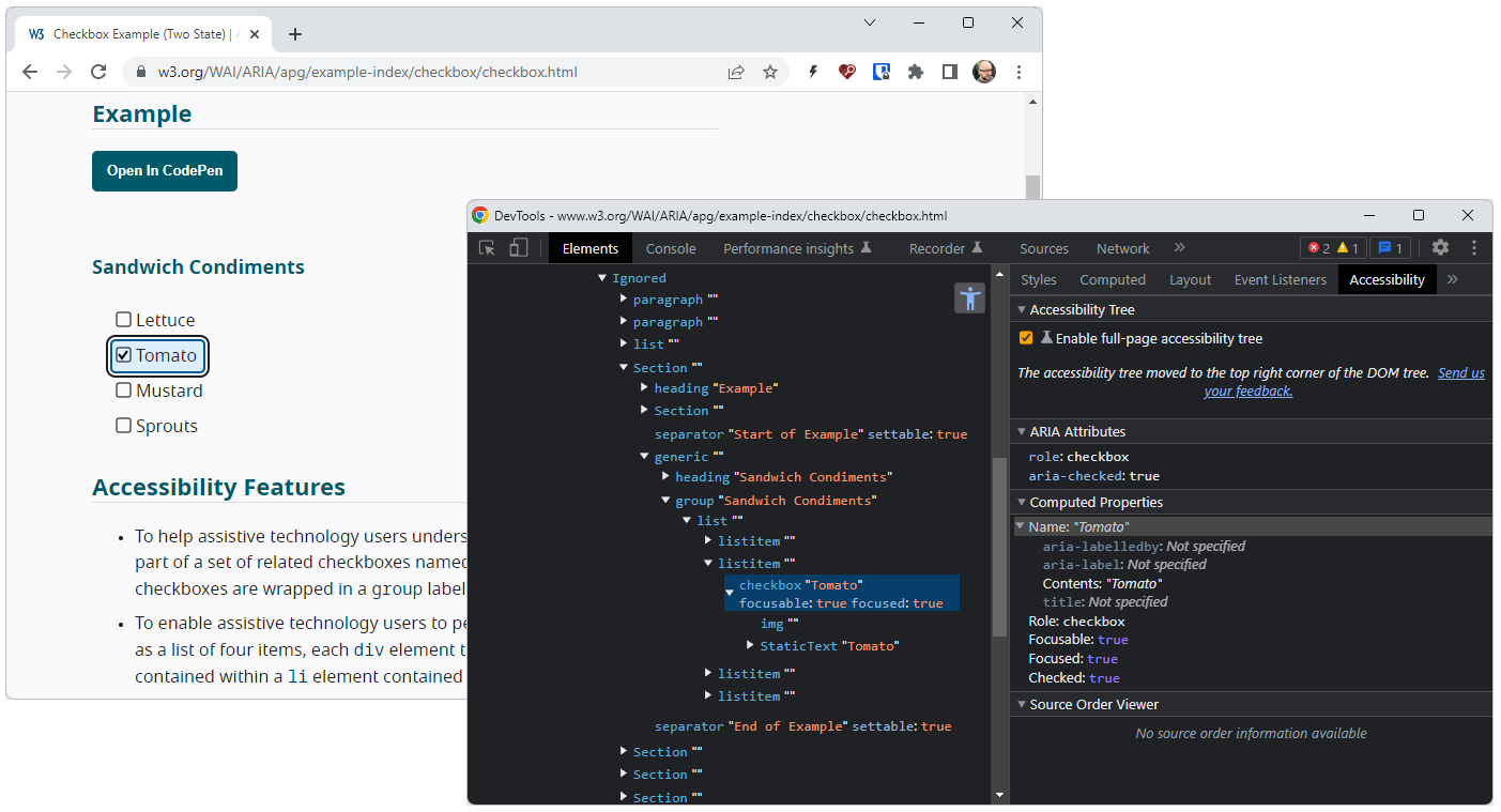
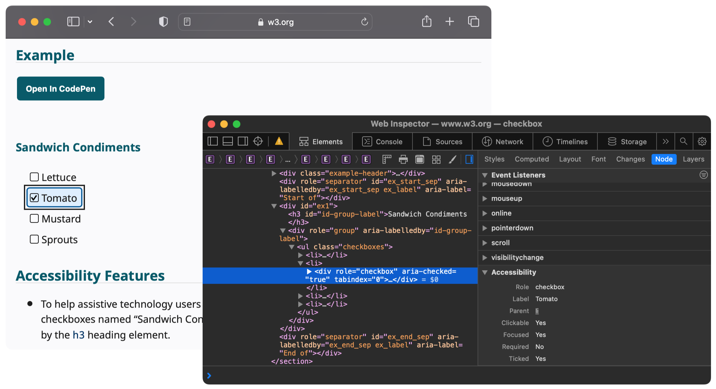
a typical DOM (as shown in a browser's developer tools, which simplifies some aspects like text nodes) and the matching accessibility tree
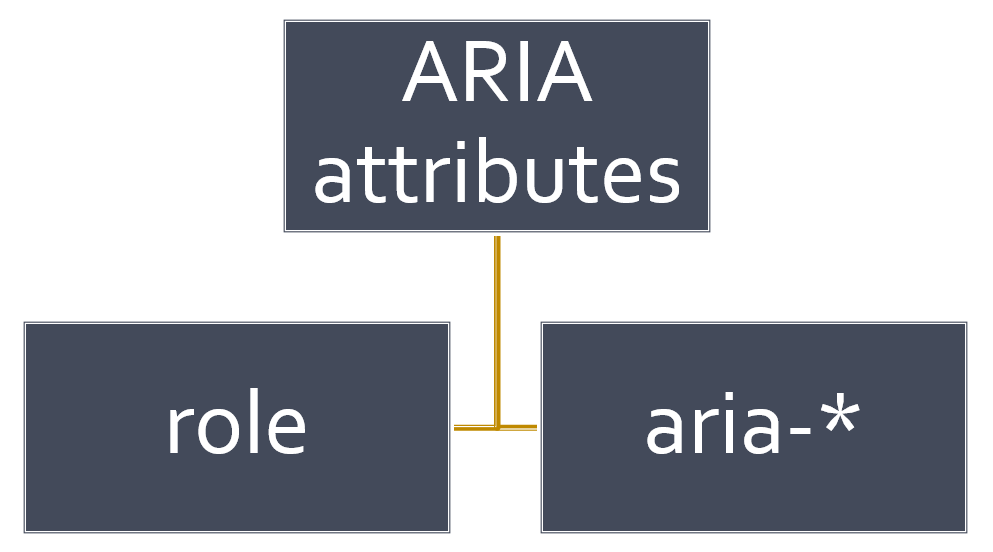
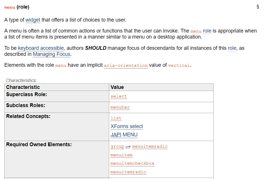
at a high level, ARIA defines various role and aria-* attributes that can be added to your markup
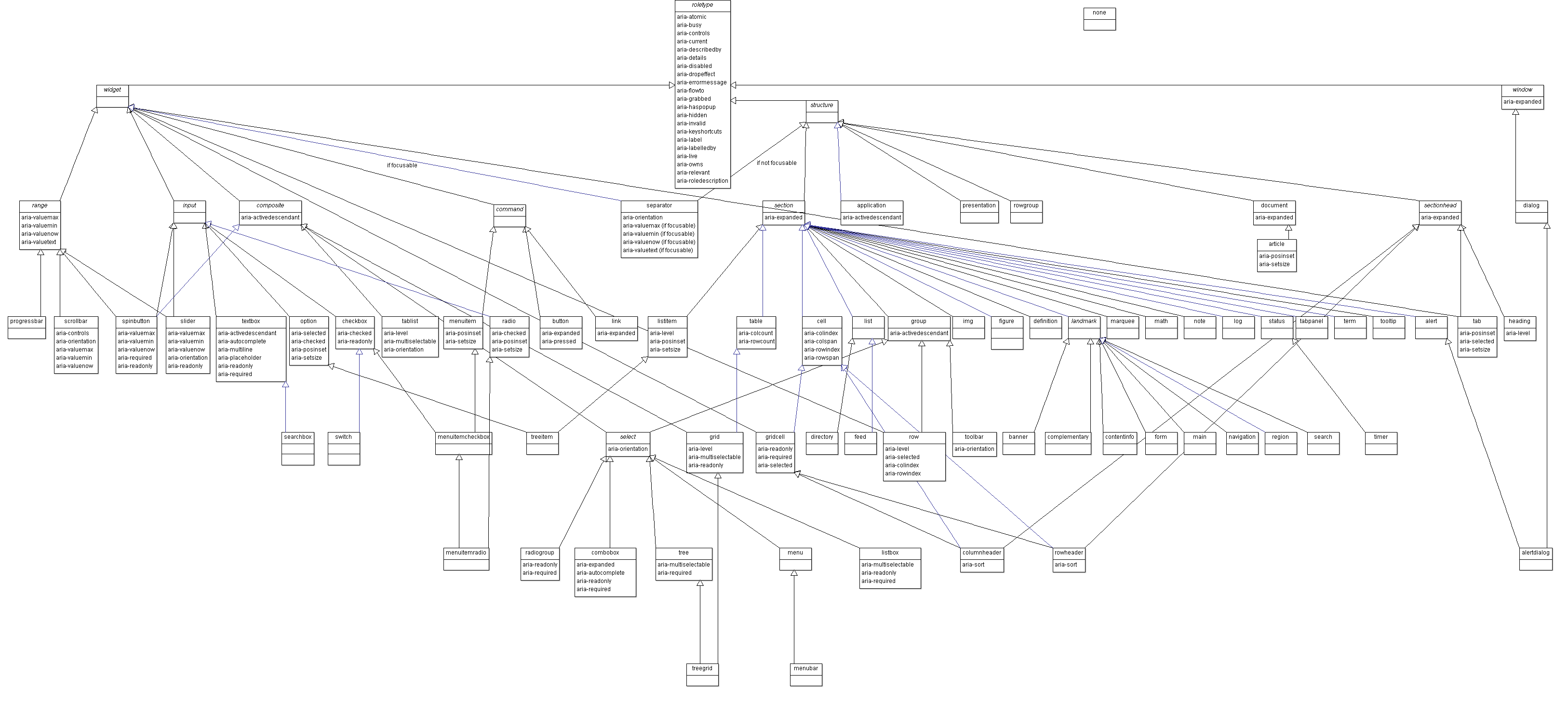
W3C - WAI-ARIA 1.2 - 5.3 Categorization of Roles
the whole model is vast and complex...and thankfully you don't need to remember this
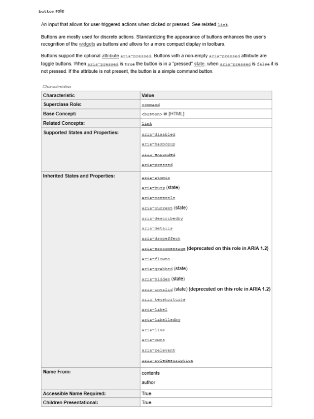
each role has "states and properties" (e.g. ARIA 1.2 definition for button)
implicit/inherited or defined via aria-* attributes
as my former colleague Karl Groves succinctly put it,
ARIA helps answer the questions:
what is this thing and what does it do?
<div tabindex="0"
role="button" onkeyup="..."
onclick="...">Test</div>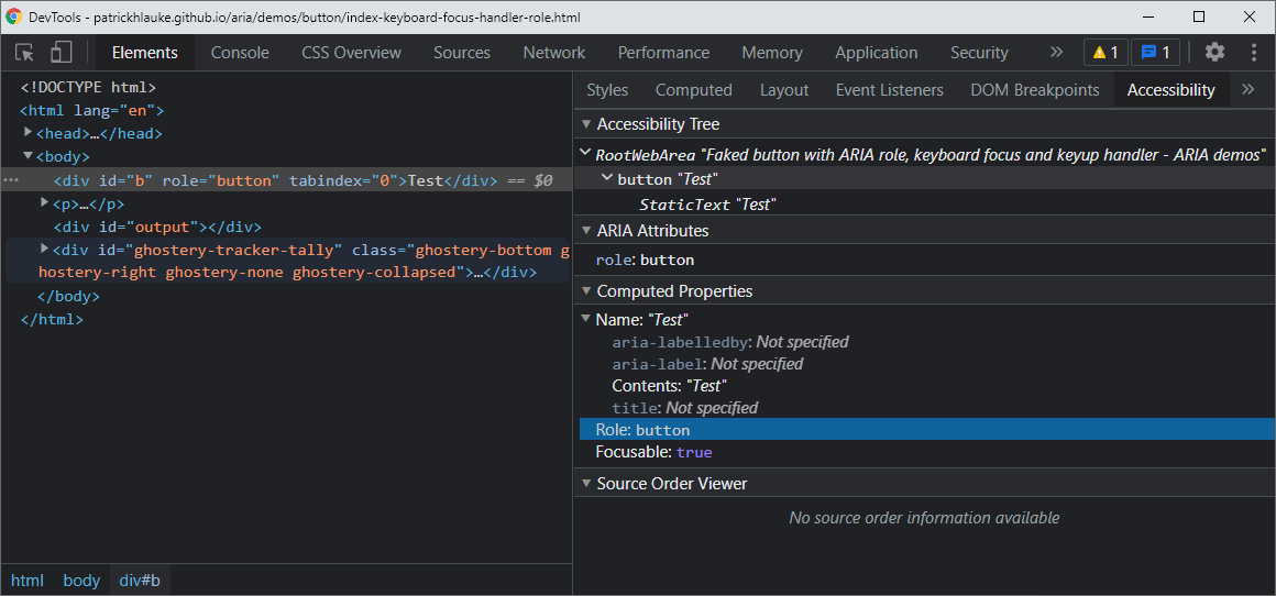
WAI-ARIA spec can be dry/technical - use for reference
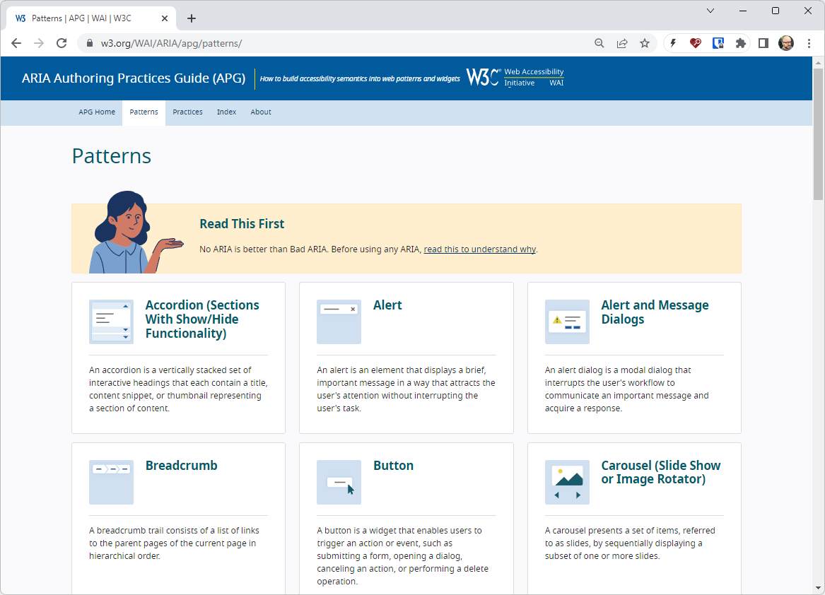
W3C - ARIA Authoring Practices Guide (APG) is more digestible.
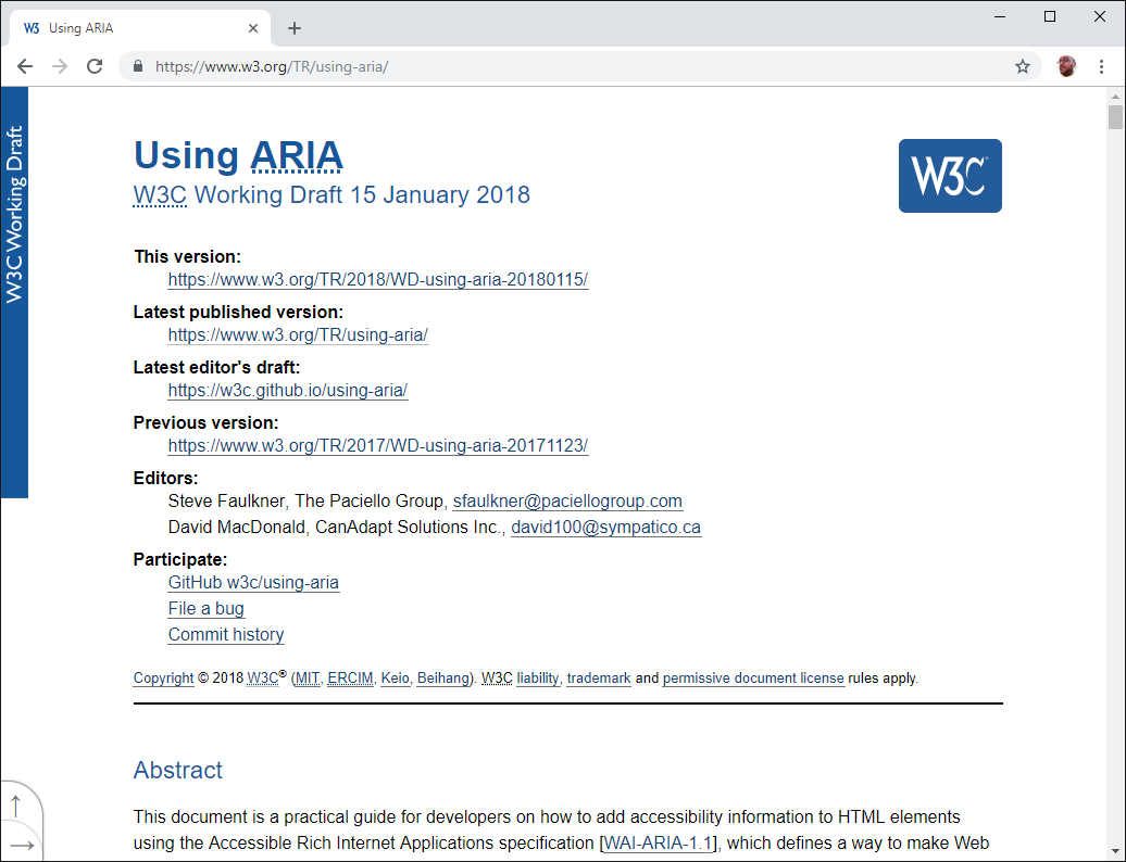
W3C - Using ARIA (Discontinued)
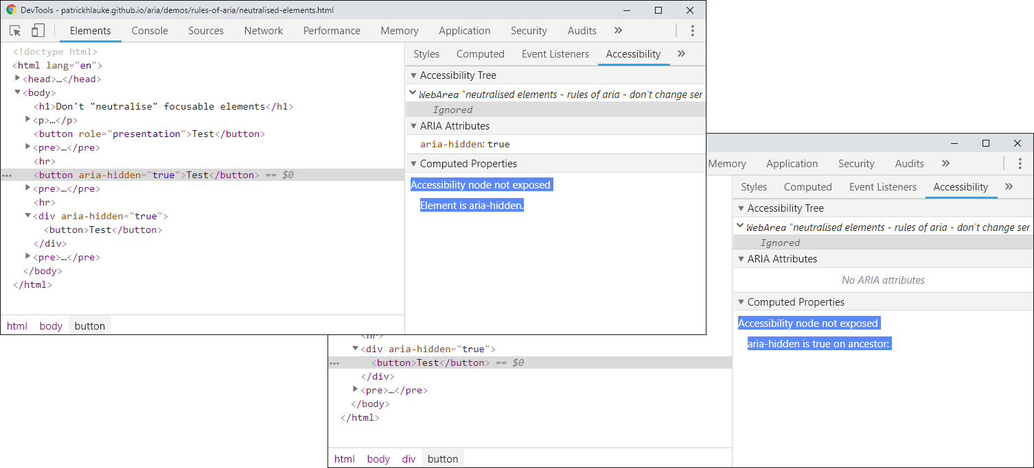
Chrome DevTools indicates when a node is hidden
(directly, or due to an ancestor being hidden)
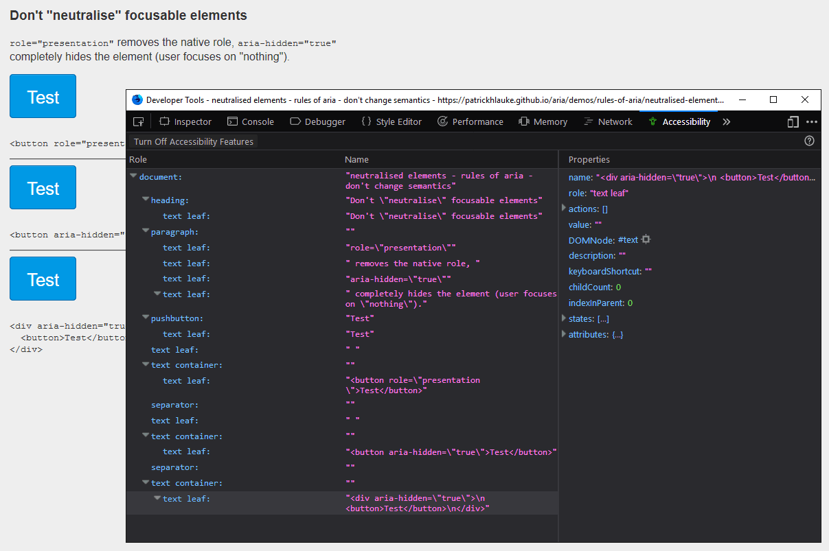
aria-hidden removes nodes from the accessibility tree
(as seen here in Firefox's accessibility inspector)
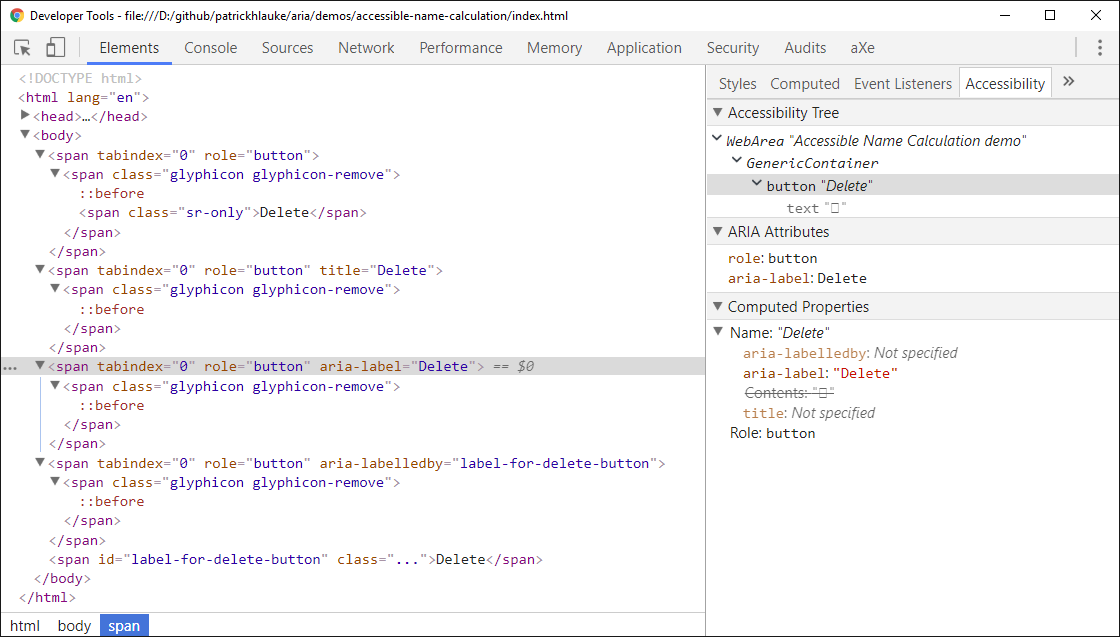
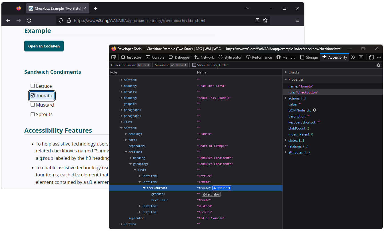
Chrome DevTools' accessibility panel can help understand which attributes contribute to an element's name
example: accessible name calculation
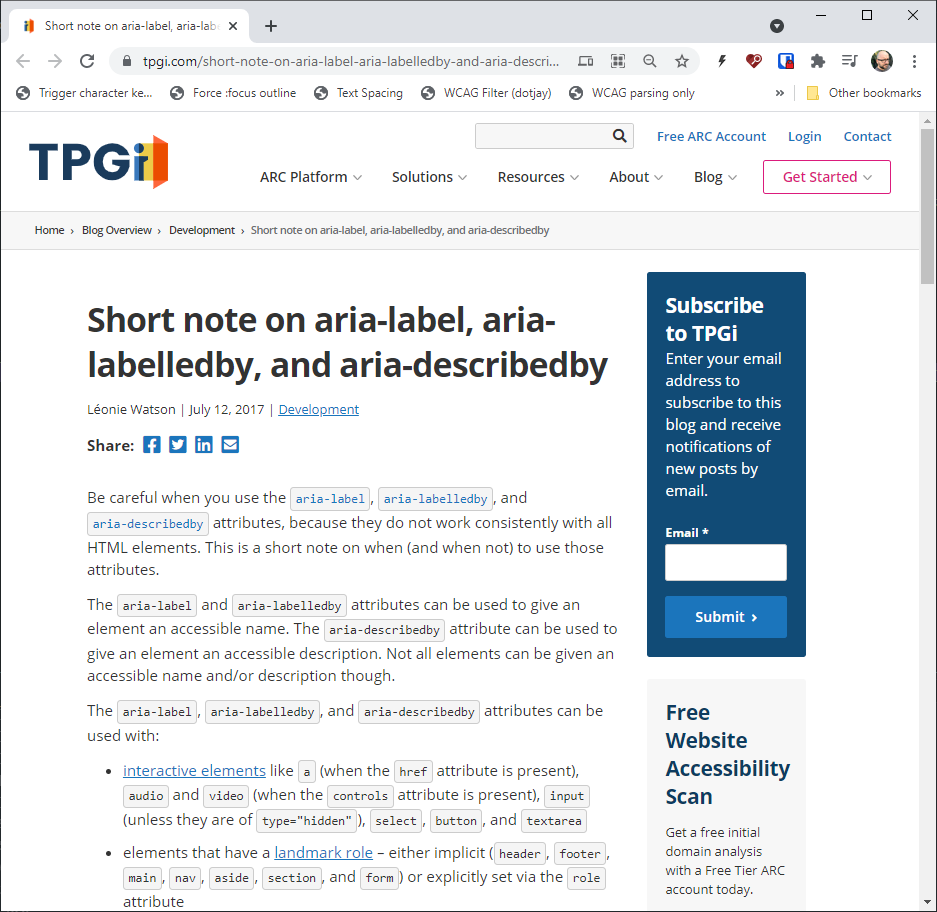
side note: aria-label / aria-labelledby / aria-describedby and arbitrary elements
(see Short note on aria-label, aria-labelledby, and aria-describedby)
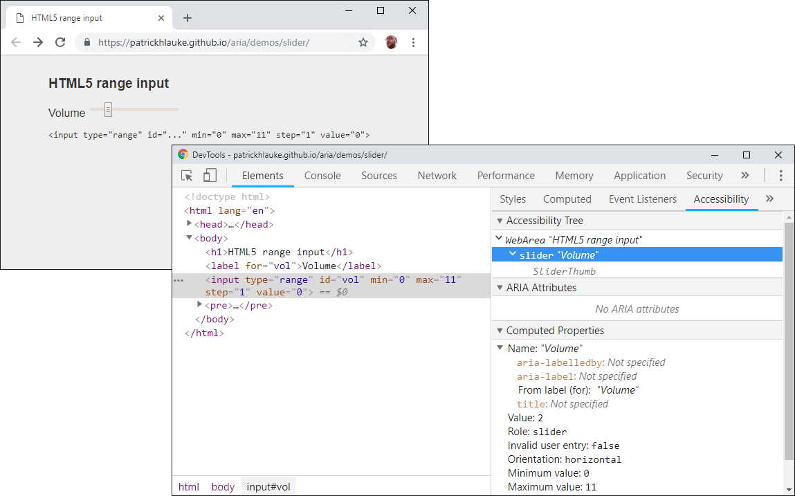
example: HTML range input
of course you can (and for many complex widgets, must) still use
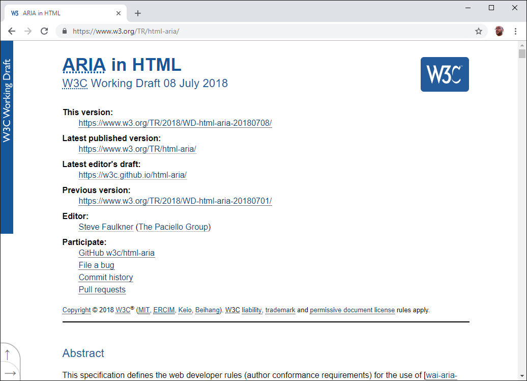
WAI-ARIA in HTML
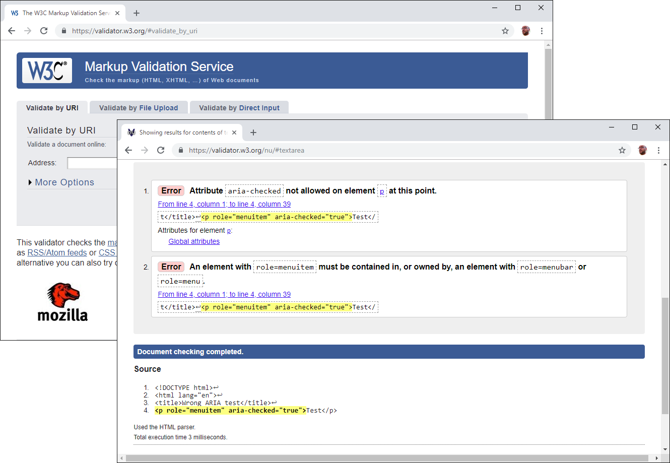
side note: you can validate pages with (static) ARIA validator.w3.org
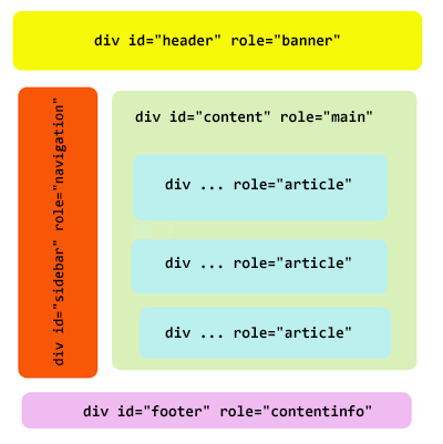
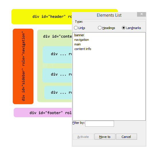
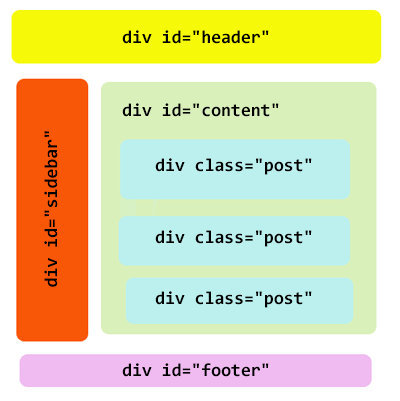
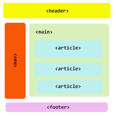
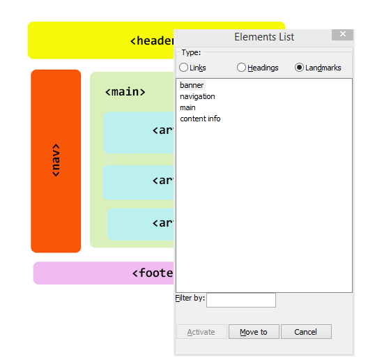
example: blog structure with ARIA
my JavaScript sucks...
(but will hopefully convey the right concepts)
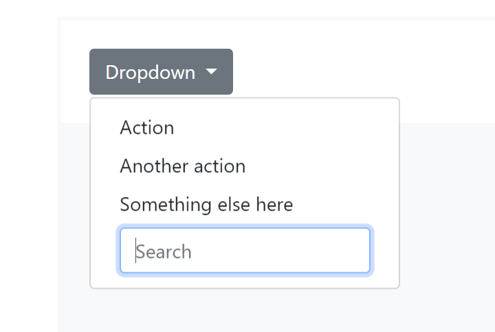
menu with a form control - not a valid ARIA menu...
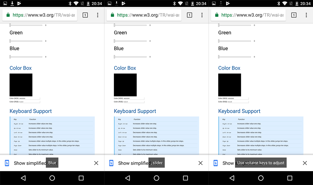
ARIA Authoring Practices Guide - Color Viewer Slider Example
on older Android / Chrome / TalkBack
("Use volume keys to adjust")
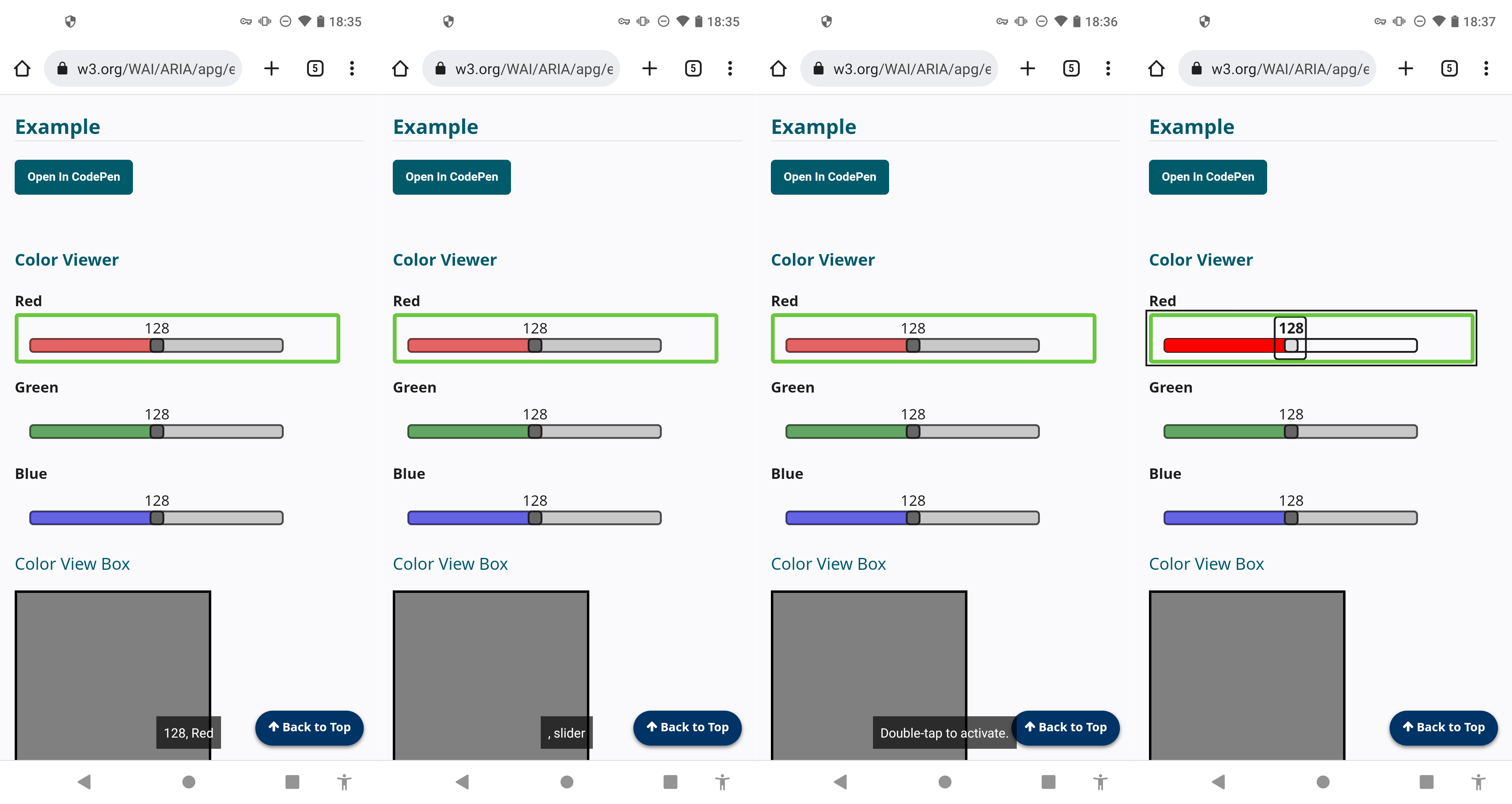
ARIA Authoring Practices Guide - Color Viewer Slider Example
on more recent Android / Chrome / TalkBack
("Double-tap to activate" but then no further announcement)
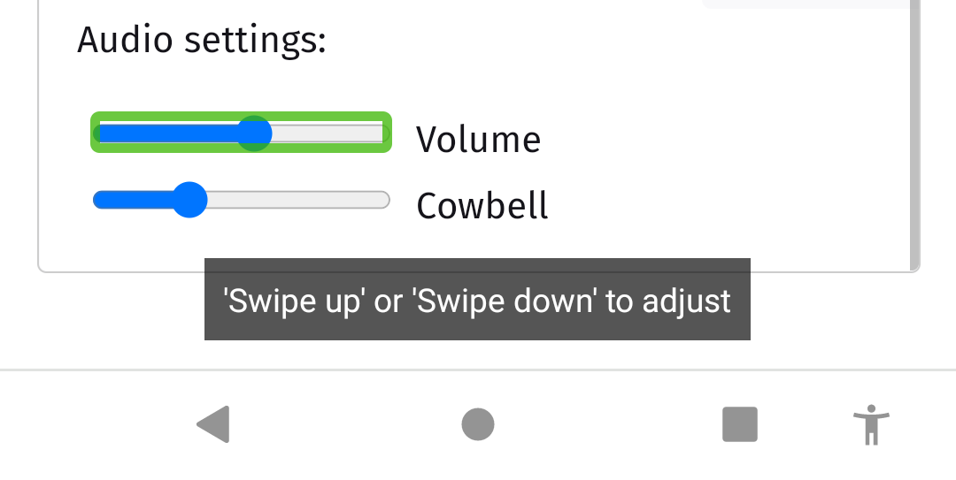
Native <input type="range">
on more recent Android / Chrome / TalkBack
("'Swipe up' or 'Swipe down' to adjust")
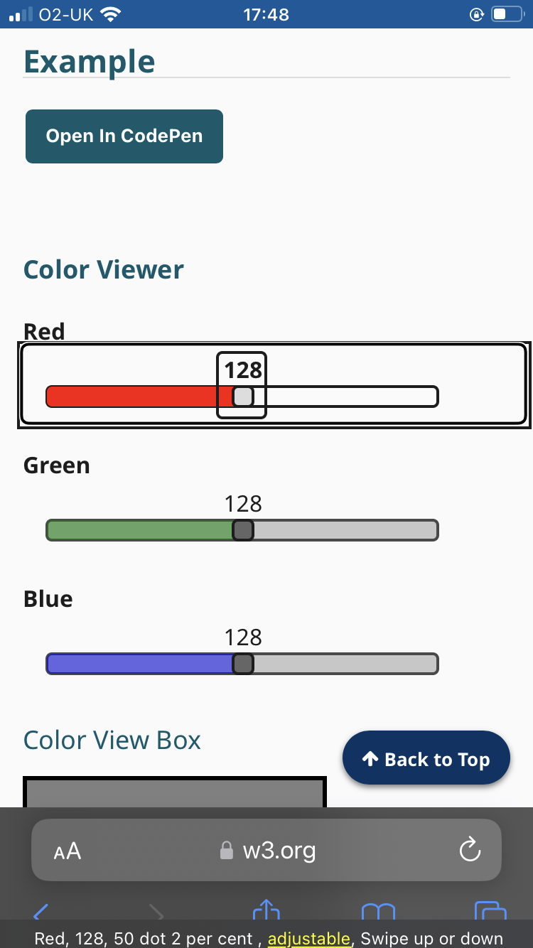
ARIA Authoring Practices Guide - Color Viewer Slider Example
on recent iOS / Safari / VoiceOver
("Swipe up or down" but it now works thanks to...)
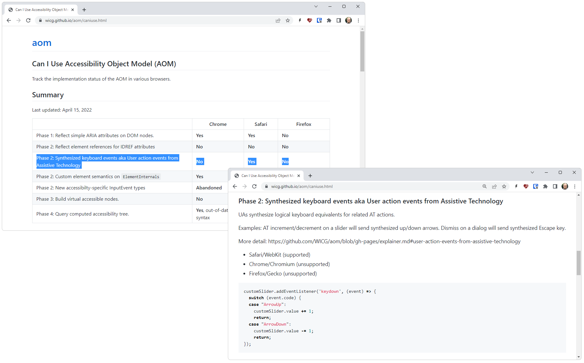
Can I Use Accessibility Object Model (AOM)
Safari/VoiceOver now send synthesized keyboard events,
but no support in Chromium or Gecko
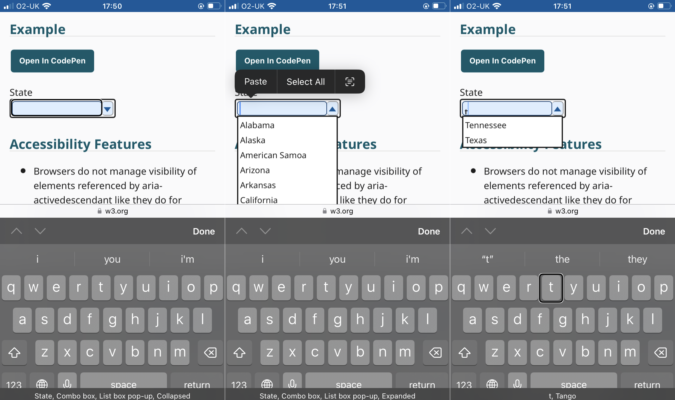
ARIA Authoring Practices Guide - Editable Combobox With List Autocomplete Example
on iOS / Safari / VoiceOver
ARIA Authoring Practices Guide - Editable Combobox With List Autocomplete Example
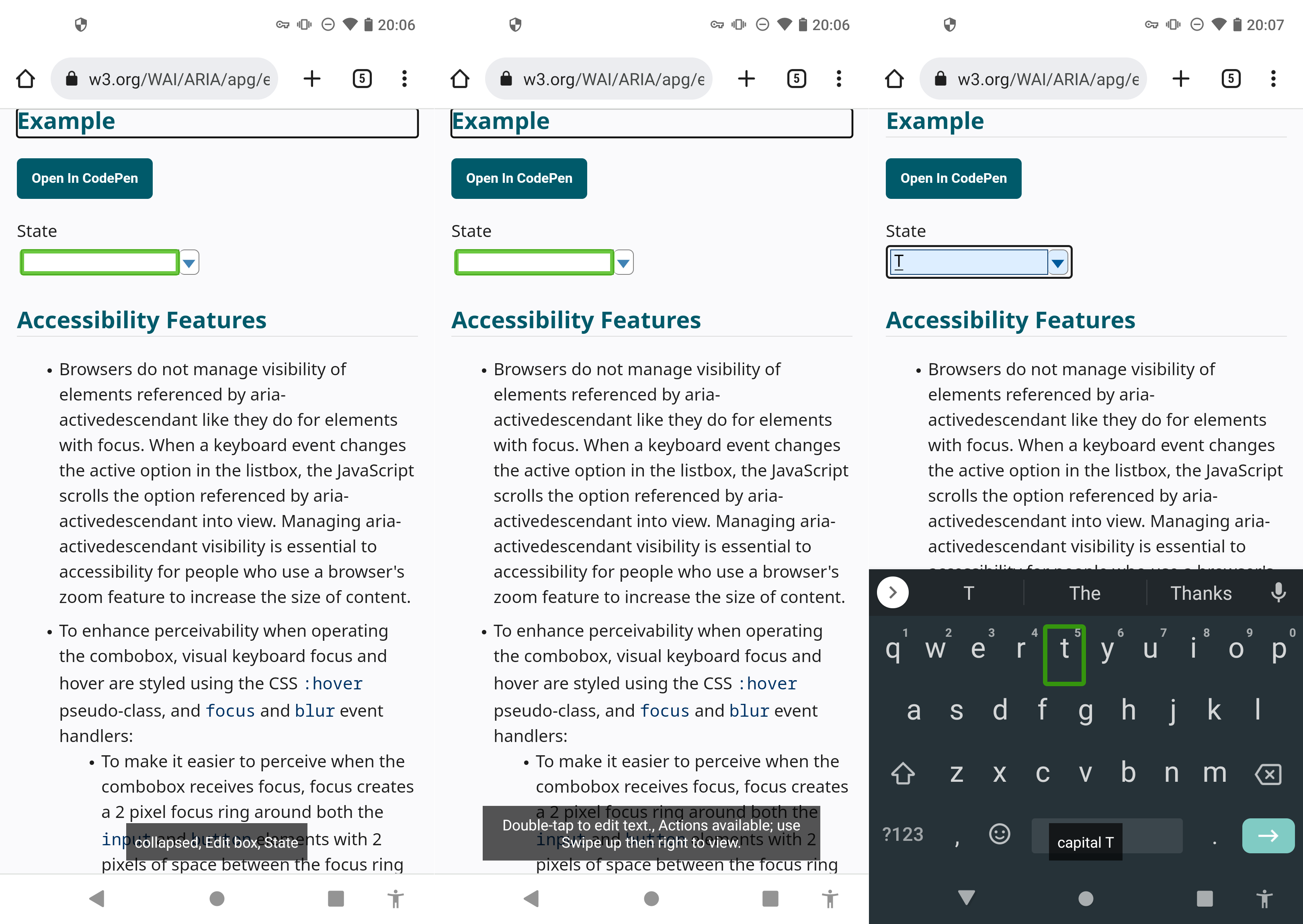
on Android / Chrome / TalkBack
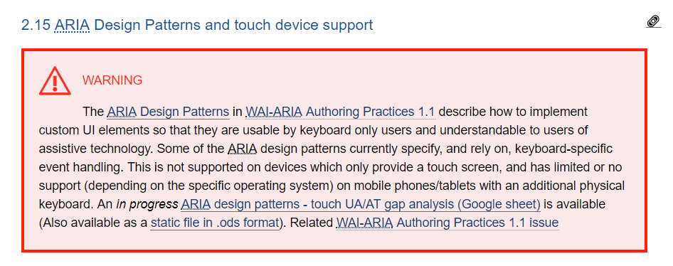
ARIA is not a magic bullet